
Concepts and Ideation

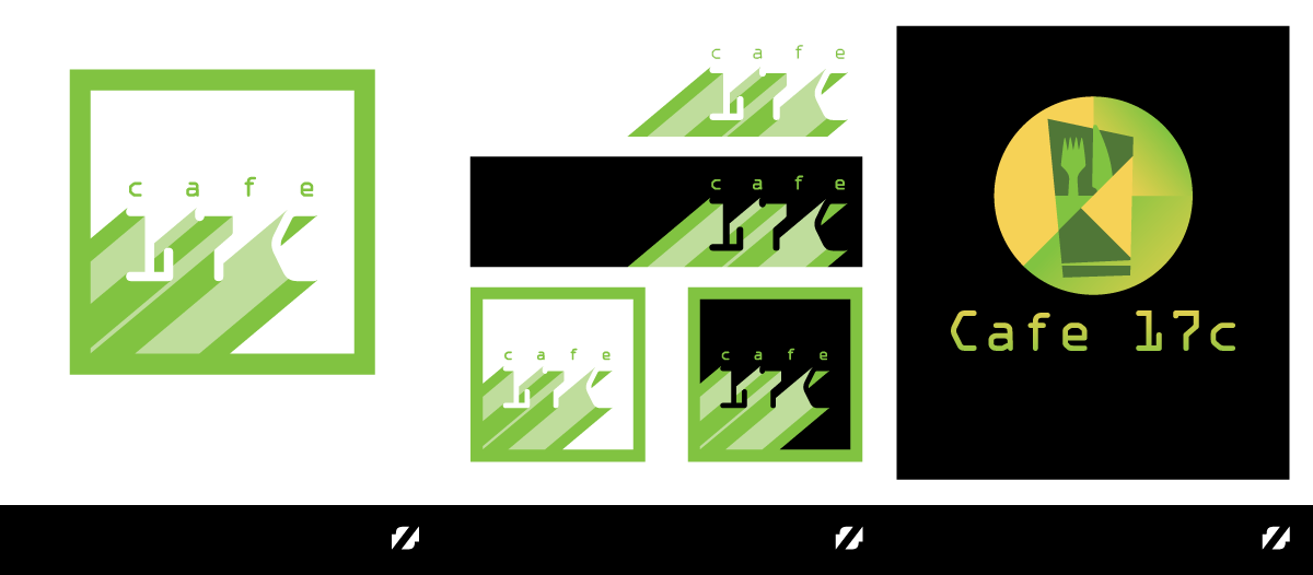

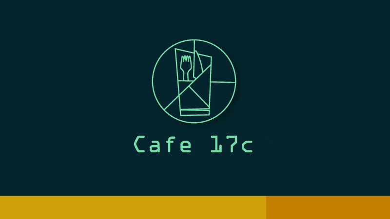
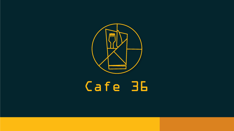
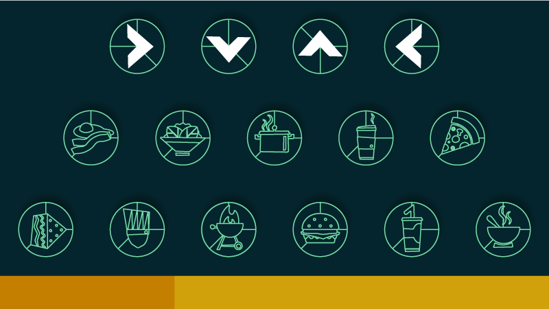
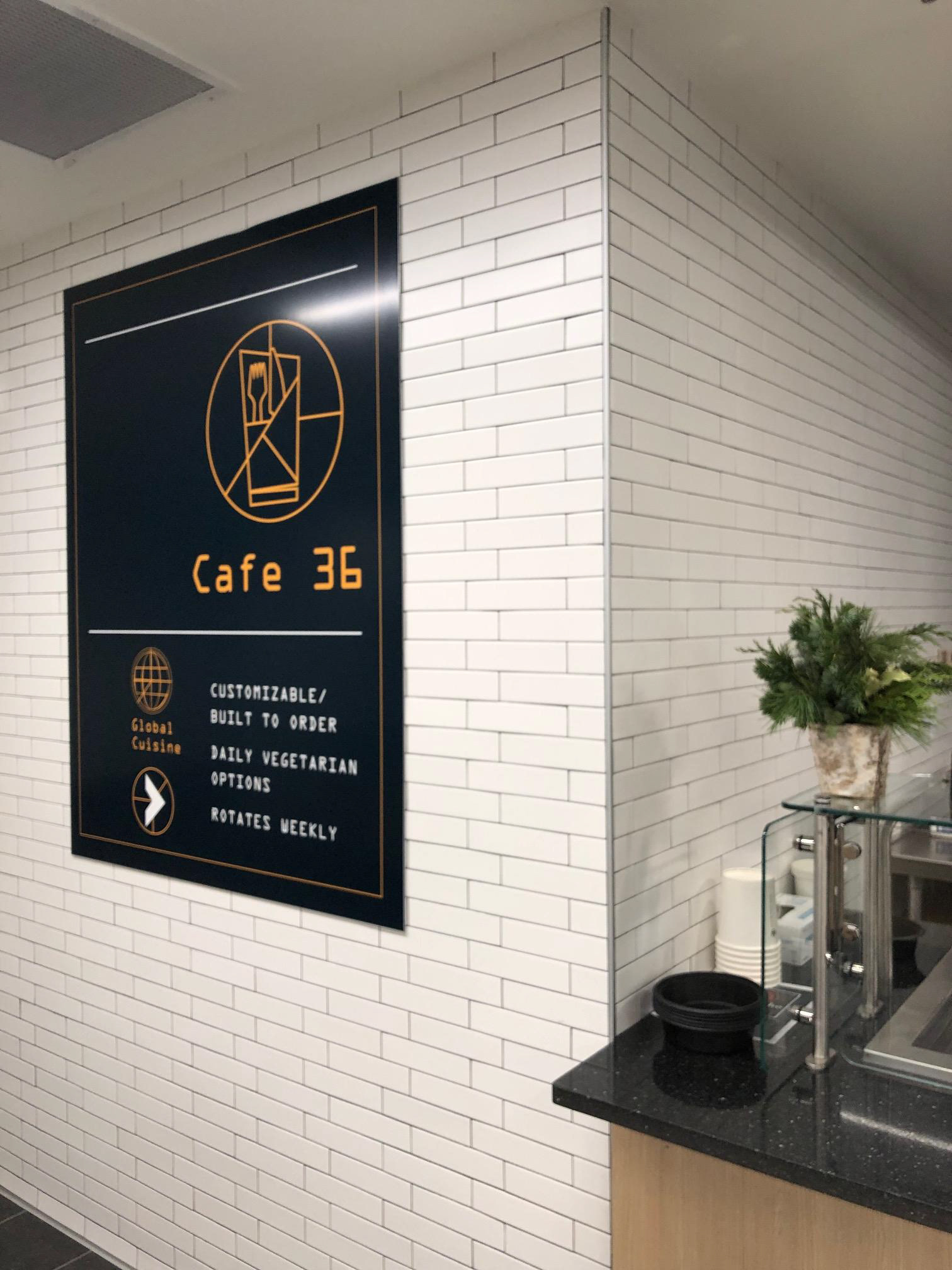
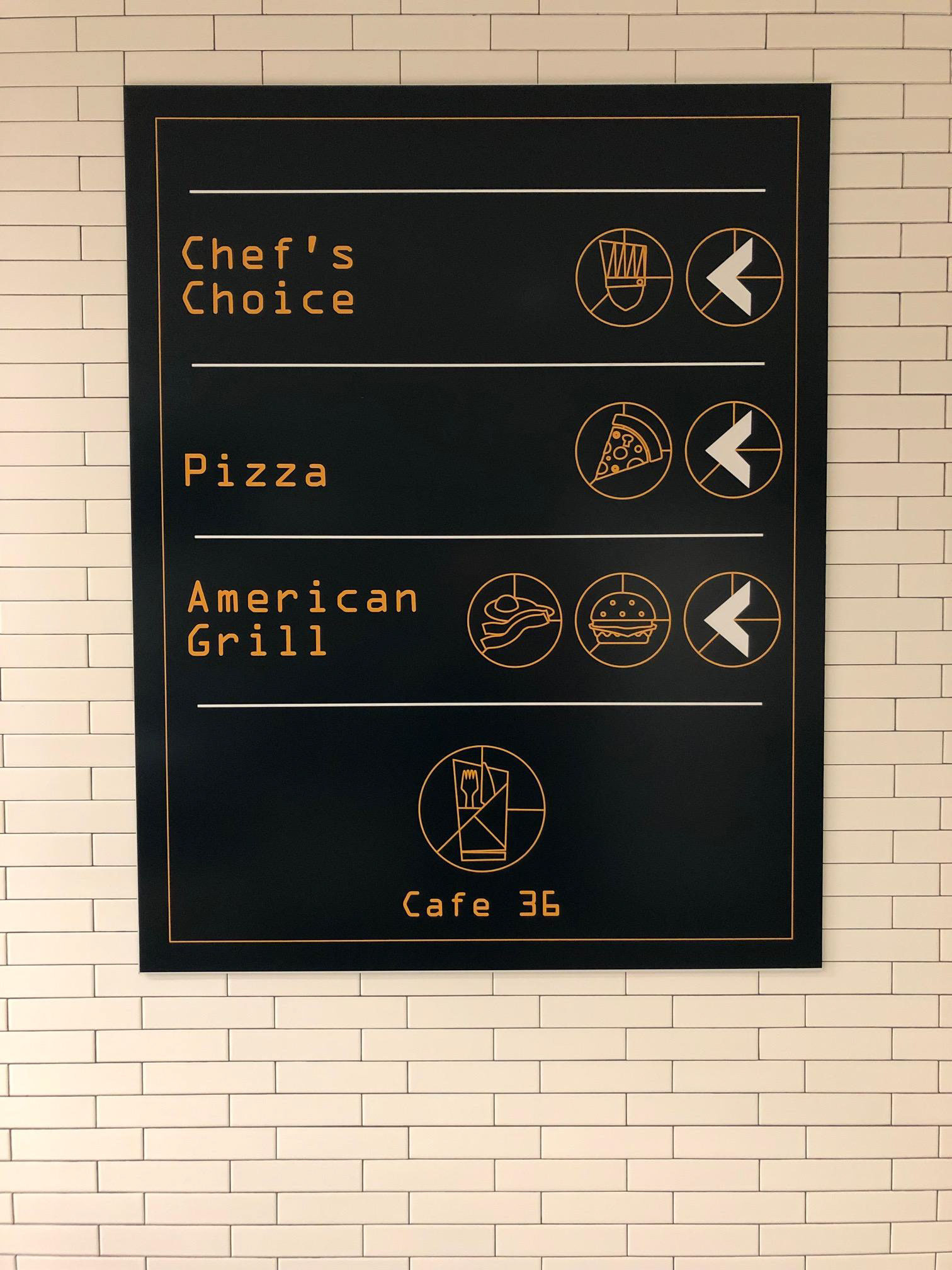
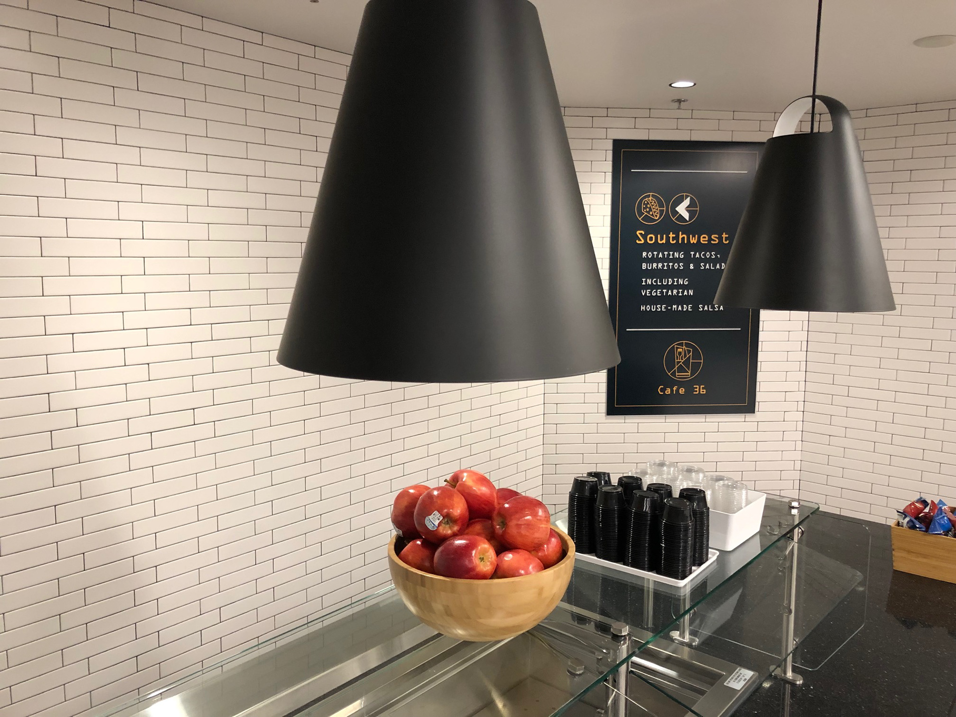
Logo and branding for Micron headquarters cafeterias, Cafe 17C and Cafe 36. Inspired by International airport design, the created logo is direct, modern and pays homage to vintage technology. The highly readable OCR-A font is employed to countinue the nod to technology. The logo is easily adapted between the two cafeterias, and lends itself to signage, uniforms, and digital assets. Design is kept minimal because the main focus is to inform and direct Micron's diverse and international staff.